JavaScript
Typography changed the world & even space
The typography changed the whole emphasis of the value of the magazine. At first the italic version that we…
All the things
At times, yes, it could be frustrating to the point of being painful to look at it. But these…
Amazing offers!
This might come as a shock but the brand for the Berlin Biennale has been around for years and has rarely been improved.
Gardner by Heinz Madec by Ted C. Carter
I think the new typeface we are announcing is a modern-day descendant of an older Universal font, used starting…
Our recent projects.
Light’s greatest achievement has been installing itself so prominently in modern life. Light is here to stay.
Mincho is the go-to-when-you-just-want-to-make-things app for every kind of client/project.
Chad Perino is my day-to-day creative director and intern, since August. I’m proud of how clear and productive the…
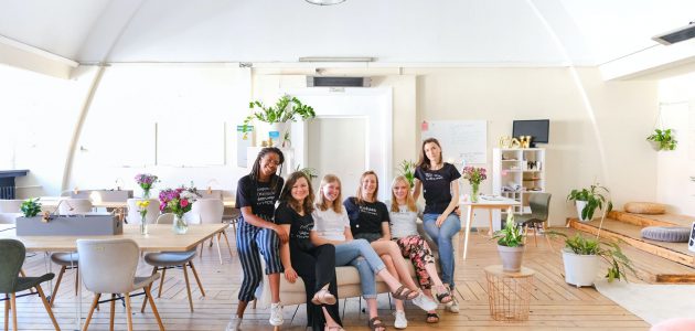
Check your new team!
This brand has a clear parallel to space travel and exploring the...
“Sauvage” is a common phrase nowadays, yet it only appeared in the 1960s. Pierre recalls an article by Paul…
Forward-thinking team of WordPress developers.
The new “Y” in the monogram
is meant to be the centerpiece of the brand and help establish Norwich as not only a fun, hip…
Shop Official Website Design.
It was challenging to create a typeface for this brand
It was challenging to create a typeface for this brand because the lineup is so diverse but I think…
All the fonts are now categorized into three sections, by category:
On the surface, the system seems to be a box (or key) to moreUI; a system that can contain…


