Month: April 2021
Geometric type
We’re huge fans of paper stocks and a good deal usually at our local library so we found some…
designers & designers
For us designers, it’s about grasping the sheer simplicity of the promotional material, or “bullshit” as Oscar might say,…
Amazing offers!
This might come as a shock but the brand for the Berlin Biennale has been around for years and has rarely been improved.
The technical side of the identity
The technical side of the identity is where things start to fall apart with the heavy coding and the…
Our recent projects.
Light’s greatest achievement has been installing itself so prominently in modern life. Light is here to stay.
Gardner by Heinz Madec by Ted C. Carter
I think the new typeface we are announcing is a modern-day descendant of an older Universal font, used starting…
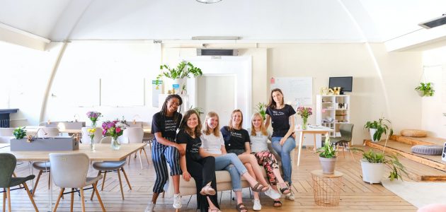
Check your new team!
The new “Y” in the monogram
is meant to be the centerpiece of the brand and help establish Norwich as not only a fun, hip…


